Experimental Interaction Design
Face filters as mirrors to our beauty
Context
Instagram beauty filters today all push for the same effect: a smaller nose, bigger eyes, and clearer skin. The emphasis on reducing the big nose has been seen as a form of ethnic erasure
It is important to recognize that these days, these filters serve as the mirror embedded in our hands. I found myself wondering, how should I look at my face through my phone?
Should I be posing differently?
Instagram beauty filters today all push for the same effect: a smaller nose, bigger eyes, and clearer skin. The emphasis on reducing the big nose has been seen as a form of ethnic erasure
It is important to recognize that these days, these filters serve as the mirror embedded in our hands. I found myself wondering, how should I look at my face through my phone?
How should we view our faces through filters?
I broke this question into two parts:
01
How should the filter interact with my features?
How should the filter interact with my features?
02
How should the filter prompt me to hold my phone when taking a selfie?
How should the filter prompt me to hold my phone when taking a selfie?
Understand
Research
I started my research by looking back historically: How did people depict faces in the past?
My biggest source of inspiration ended up being my mother. My mother is a Rajasthani artist and I was always fascinated how in her traditional works, the face was angled to the side. That angle revealed the details of the person’s bone structure, emphasizing the features that today we try to hide- like nose shape.
I became curious how I could get people to highlight their nose in a similar way.
Ideate
prototype 1
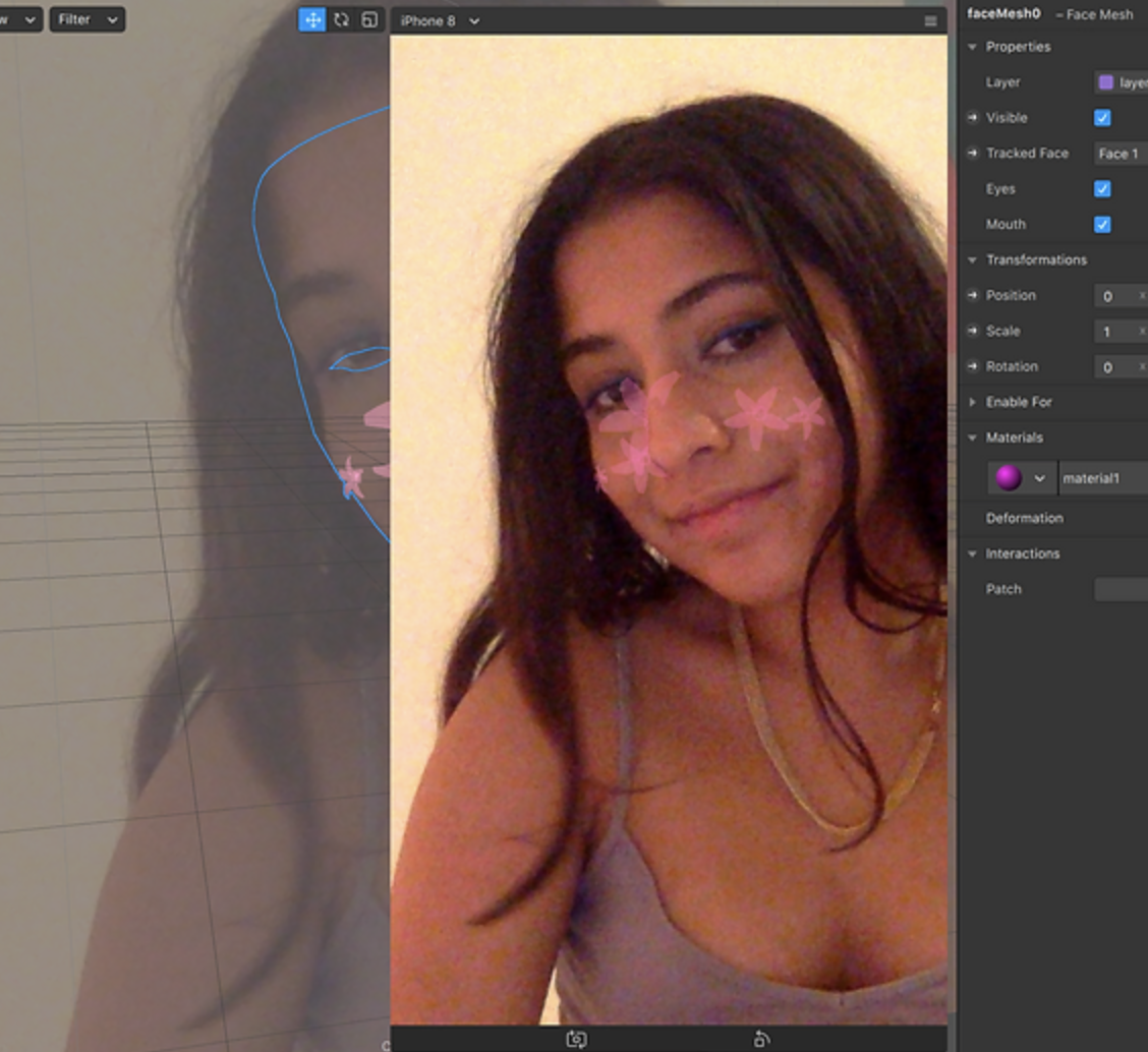
The obvious way was for people to turn their faces when working with the filter. This would highlight their mature bone structure and unique features. So I played around with creating a filter that had a flower blossom from the side of the nose to incentive users to turn their heads.
The obvious way was for people to turn their faces when working with the filter. This would highlight their mature bone structure and unique features. So I played around with creating a filter that had a flower blossom from the side of the nose to incentive users to turn their heads.
prototype 2
The second concept was to create some effect that emphasized the nose rather than de-emphasizing it. This change was a lot less invasive in the interaction since the filter didn’t overtake the features and didn’t require a large change in how the user held the camera.
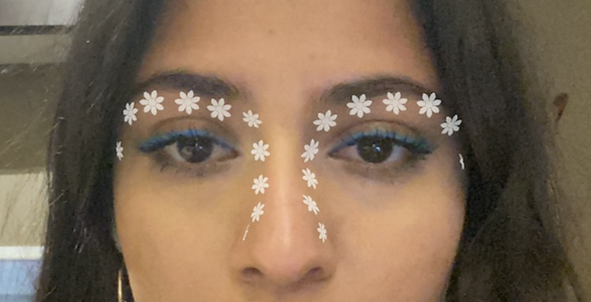
I choose to use daisies going down the sides of the nose. Usually, this is a place that is minimized by most filters. I wonder if people could still feel beauty if bright highlighting white flowers were placed in such an area.
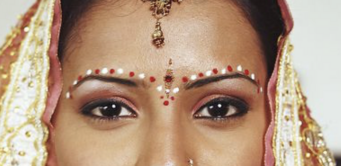
Referring back to the traditional Indian art I mentioned earlier, I took inspiration from traditional bindi work for this design. While bindis do not go down the sides of noses, I look how they highlighted features and wanted to incorporate that structure.
my AR filter
traditional bindi design
Testing
After having a few people try out the interaction that promoted turning the head (prototype 1), I discovered that users felt that the angle felt "old". That sharp angle was associated with the "mom angle" and after a few Google searches, I discovered that kind of angle was a meme.
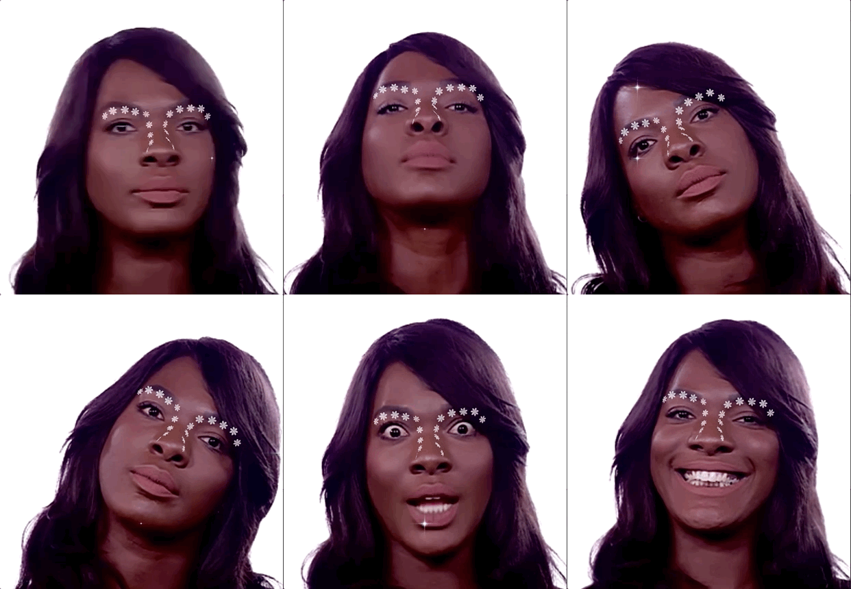
While most people just found the filter fun to use, many people noted that they loved how it did not minimize the details of their faces or promote Eurocentric standards. This obviously met my metrics of success!
While most people just found the filter fun to use, many people noted that they loved how it did not minimize the details of their faces or promote Eurocentric standards. This obviously met my metrics of success!
conclusion
Emerging technologies have to strive to be anti-racist
Before I end this, I want to note that I do not find traditional Instagram face filter creators as maliciously enforcing racist ideologies. However, this project serves as example of the importance of intention, critique, and reflection as we create our technological futures.
As we build tomorrow, how do we not repeat the past?

(Insights on face filter usage - two months post launch)

